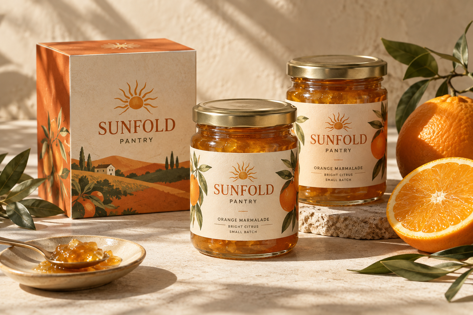
Sunfold Pantry
Fictional conceptBrand identity & packaging / Food
A sunny identity for an imagined small-batch pantry brand. Expressive lettering and illustrated labels make everyday rituals feel special.
Distinctive identities and packaging for small brands with something good to share.
Explore the workA little01 / Selected work
An exploration of food and homeware brands, imagined with care.
Brand identity & packaging / Food
A sunny identity for an imagined small-batch pantry brand. Expressive lettering and illustrated labels make everyday rituals feel special.
Brand identity & packaging / Homeware
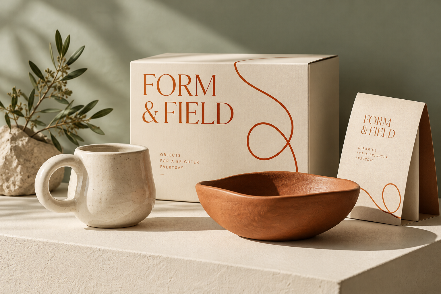
A gentle, playful identity for an imagined ceramics studio. A wandering line brings a human touch to tactile, understated packaging.
02 / The studio
Hi, I'm Morgan, the designer behind Fernwick. From my studio in North Carolina, I create identities and packaging for independent food and homeware businesses.
I believe good design should feel like the people behind it. My approach pairs a clear point of view with warmth, making room for the little details that give a brand its character.
A distinctive visual language that feels like you, from the wordmark to the smallest detail.
Considered design that gives your products presence, on a shelf and in someone's home.
03 / The journal
A place for thoughts on design and the pleasure of making things.
The most memorable detail is often a small one. An unexpected curve in a letter, or a line that wanders a little, can turn a tidy identity into something with feeling.
For the Form & Field concept, that idea became a loose, looping line. It gives the packaging a sense of movement while leaving the ceramics room to speak for themselves.
A label is an invitation before it is an explanation. Color and lettering can offer a glimpse of what matters to a brand, even before the first word is read.
Sunfold Pantry explores that invitation through warm orange and illustrated landscapes. The aim is simple: to make a small everyday moment feel worth savoring.
04 / The print shop
A space for Fernwick's future art-print collection, bringing a little of the studio into everyday spaces.
The collection is in the making. Prints will be available here when the shop opens.
Print shop coming soon05 / Say hello
Have a food or homeware brand in mind? I'd love to hear about it when studio enquiries open.
Enquiries opening soon